CSB Eats Case Study
Scope: UI/UX Design, Product Design, Branding & Visual Identity, App Design
Tools Used: Figma, Adobe Photoshop, Adobe InDesign, Google Forms, Google Slides
Role: Researcher, Interviewer, UI/UX Designer, Presentation Designer, Presenter
Timeline: 4 weeks
Collaborative project completed with Pooja Gandhi and Nicole Machnowski
CSB Eats is a mobile application developed specifically for students who attend classes at the Civic Square Building (CSB), a part of Rutgers University–New Brunswick (or Rutgers–New Brunswick/Rutgers NB), Rutgers University’s flagship campus, and New Brunswick’s government and theatre district. It’s designed to give CSB students a consolidated, up-to-date list of all the available food options located within walking distance of the building as well as facilitate delivery-sharing among students to streamline food arrival times. Busy students can find food fast, order ahead, and coordinate food delivery with their peers to optimize their lunch time.
Problem: Many students attending classes at the Civic Square Building (CSB) of Rutgers University in downtown New Brunswick have little to no time to order food for lunch and don’t fully know what all of their food options are in the surrounding area, including which restaurants accept meal swipes.
CSB students, particularly those attending classes at the Mason Gross School of the Arts, have 30-70 minute unscheduled lunch breaks during their 3-6 hour intensive studio classes everyday. Due to this frequent lack of flexibility with these breaks and no centralized app for food, this leaves students little time to:
See all of their food options around the city (there are no dining halls in downtown New Brunswick)
See what restaurants accept meal swipes
Check wait times of restaurants they possibly want to eat at
Solution: Our team created an app that will allow CSB students to:
Organize and consolidate all of the restaurants around CSB, providing current food offerings, hours, wait times, and food swipe eligibility so students will have a concurrent list of all available restaurants
Order food and choose what pickup/delivery options best work for them, including options to coordinate food delivery between peers/classmates
User Research
Our team conducted in-person interviews with students who attended classes at CSB and sent out an online survey distributed via a QR code on flyers to get a general consensus surrounding opinions on the food options near CSB and different ways they acquire food.
18 students responded to our online survey. Some of the questions asked included:
Key Findings:
Most CSB students:
Order food on an average of 2-3 times a week during their breaks
Express an interest in knowing what food options they have available, particularly around George Street (a popular and busy street in downtown New Brunswick just around the corner from CSB)
Want to use meal swipes as a form of payment for food options
Would rather have their food delivered, and most were not opposed to having a trusted individual deliver their food to CSB as opposed to an unknown person
While apps such as Uber Eats, DoorDash, Grubhub, and Google Search already exist as popular ways people find and order food, CSB Eats beats out its large-scale competitors because it focuses on:
✅ Localized discovery of restaurants and quick food
✅ Direct connectivity to the community it serves by being made by CSB students, for CSB students
✅ Fostering and facilitating connectedness between students by supporting social ordering
Design Process and Usability Testing
App storyboard
Lo-fi Prototype
Usability Testing
6 students tested our lo-fi prototype. Most liked the clarity of navigating through the app and certain app features like the promotions page and search options.
Features they requested to be changed included:
Alter formatting on some pages to make it more visually appealing, more white space
Add an onboarding section to get the users interests/likes
Box around items in checkout to make it clearer on the receipt page
Swap interaction of delivery and pickup buttons on delivery selection page
Make promotions link to checkout page (could be a unique overlay that adds the promotion to the checkout option)
Add rewards feature to checkout screen
Make the search button itself the means of opening the overlay, the search button should be the means to find something.
Make the settings popout full-screen
Make more frequent actions more accessible like accessing favorites quicker, makes navigating the app easier
Final Prototype and Outcome
Branding
We implemented onboarding screens as suggested during usability testing
Key Design Decisions:
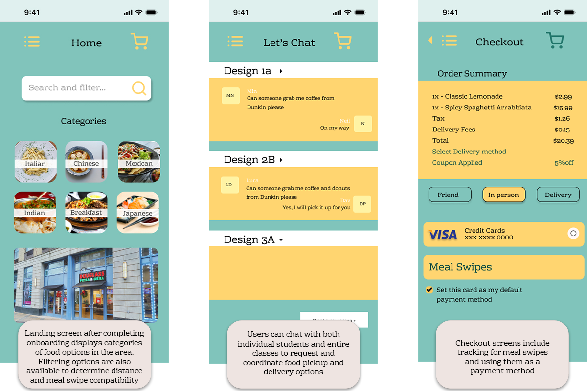
The final prototype streamlined the decision process for CSB students ordering lunch between classes and allowed them to successfully:
✅Gain transparency of food options in downtown New Brunswick, where CSB is located
✅See what locations accept meal swipes
✅Coordinate reliable delivery between classmates in one place
During informal testing with peers, students reported that the app’s design made it significantly easier to identify nearby options quickly and get up-to-date information on all types of food located around CSB, pricing, and meal swipe compatibility.
What I Learned
Even if CSB Eat’s target audience is a very niche population (concentrated only to the few thousand students that attend classes in the Civil Square Building), I learned a lot during the production of this app, particularly in becoming more cognizant of user needs and designing under real constraints. Completing the project under the guidance of our design mentor, we followed a timeline, schedule, and guidelines that mirrored real-world UI/UX practices designers use when creating interactive user experiences.
After carrying out surveys, interviews, and user testing, I understood just how important user feedback is when planning an app. Our student testing group gave a lot of helpful feedback that were honest oversights on our part while we were in the early stages of prototyping. UI features such as back buttons and the settings being full-screen instead of a pop-up menu are practically standard in commercial apps today, but we didn’t implement them during our storyboarding and lo-fi prototyping. Both testing and competitor research were key to understanding how to optimize the app’s design for speed and efficacy so users don’t have to perform a lot of actions to get the information and/or carry out the tasks they’re trying to accomplish. In future UI/UX and product design projects, I’ll be sure to optimize for these elements so users won’t have to deal with headaches using products I designed.